

(BRANDING STRATEGY)
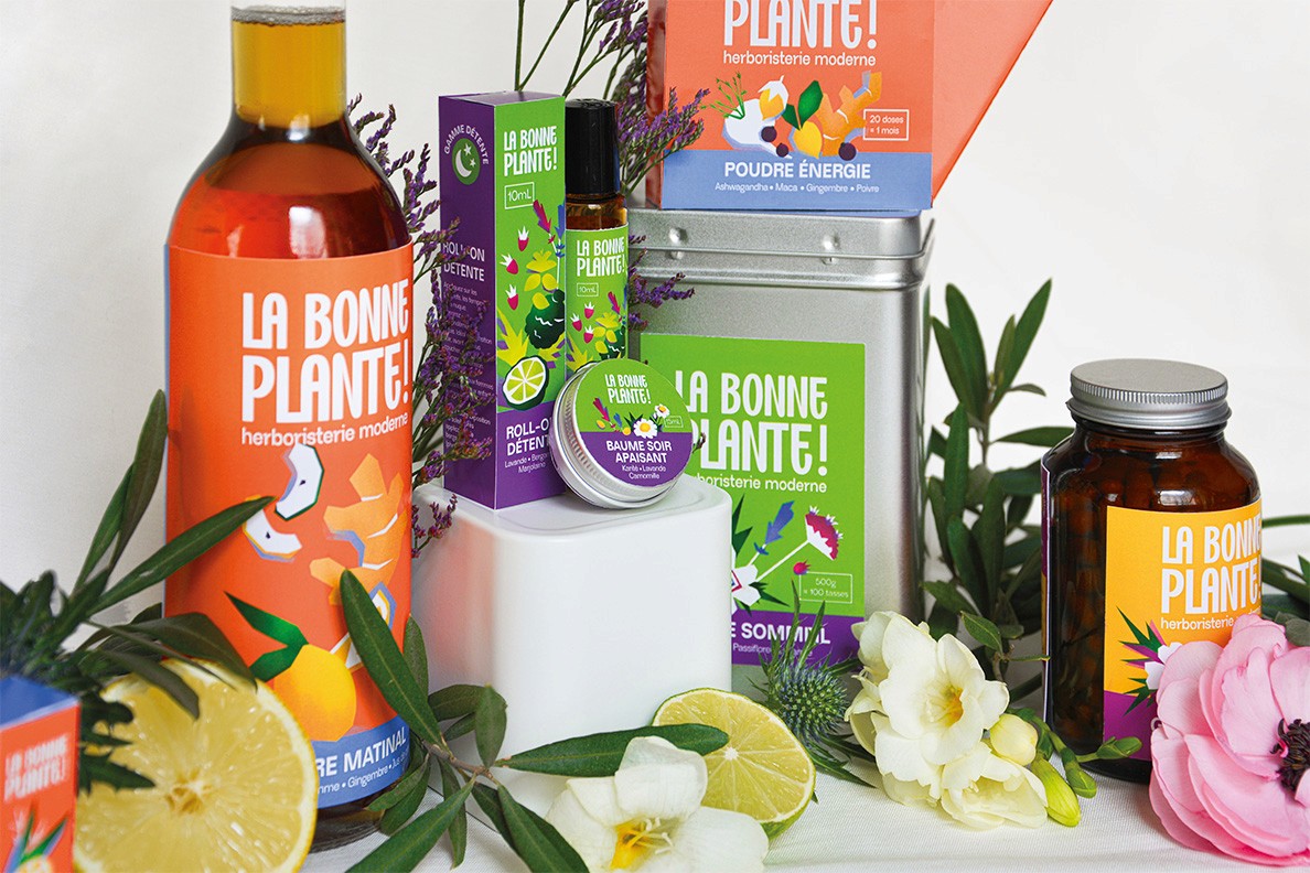
We developed a colorful, engaging, and bold visual identity that intentionally disrupts traditional industry codes. The typography is impactful and assertive, yet its subtle curves infuse the brand with warmth and humanity. An exclamation point injects energy into the design, acting like a burst of "good news."
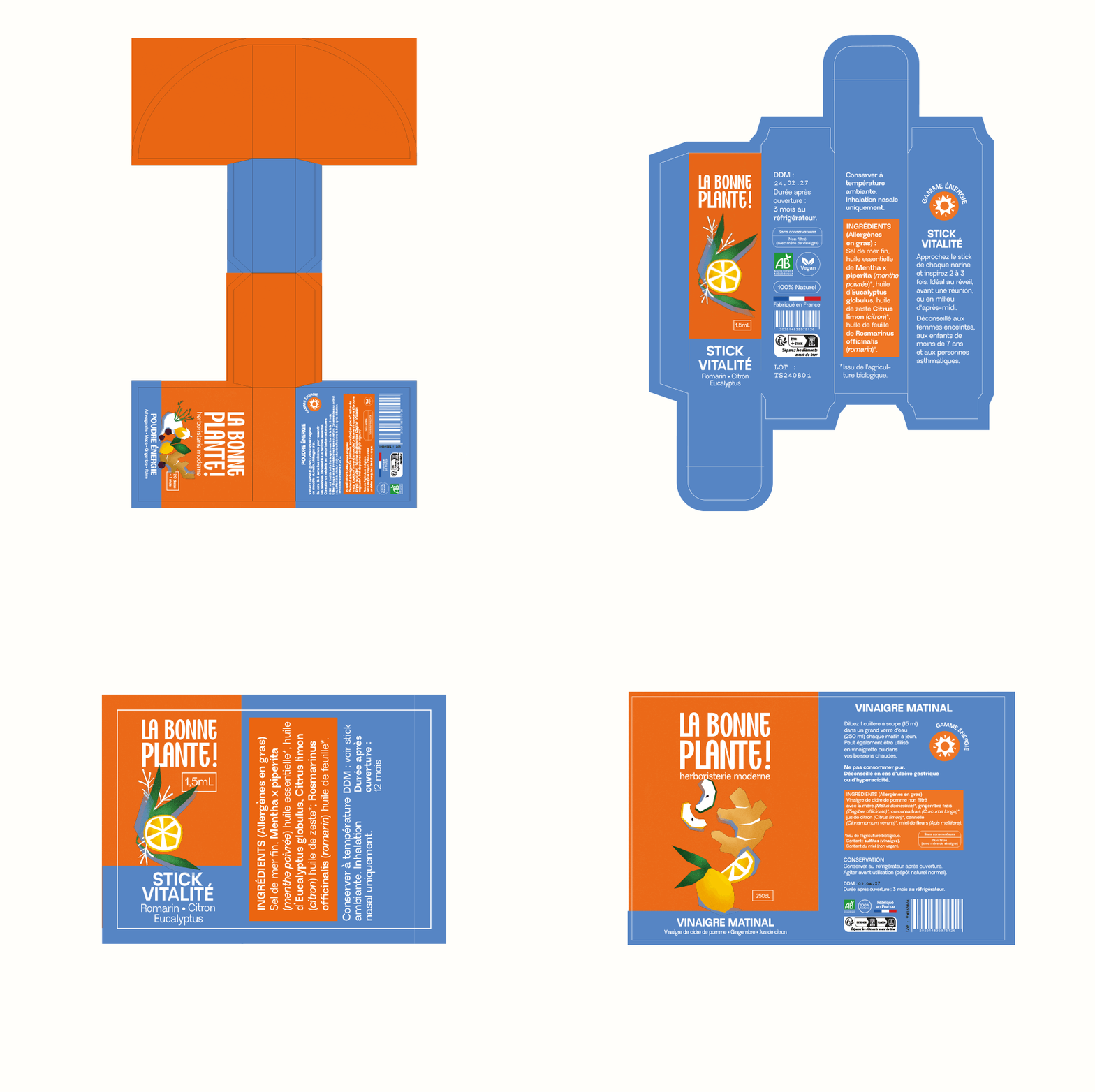
For the packaging, the primary focus was immediate clarity. The core benefit (Relaxation, Energy, Beauty) is boldly highlighted and paired with a strong color-coding system. Key ingredients are then illustrated in a clean, distinctive style. Finally, the curated box sets are designed to inspire a simple, instant daily routine. Ultimately, this identity elevates the product from a hidden medicine cabinet staple into a desirable lifestyle object.




(THE CAMPAIGN)



(WEBSITE & SOCIAL MEDIA)
The website allows customers to easily find products tailored to their needs, highlighting the brand's added value of convenience and connection. [View the website here]
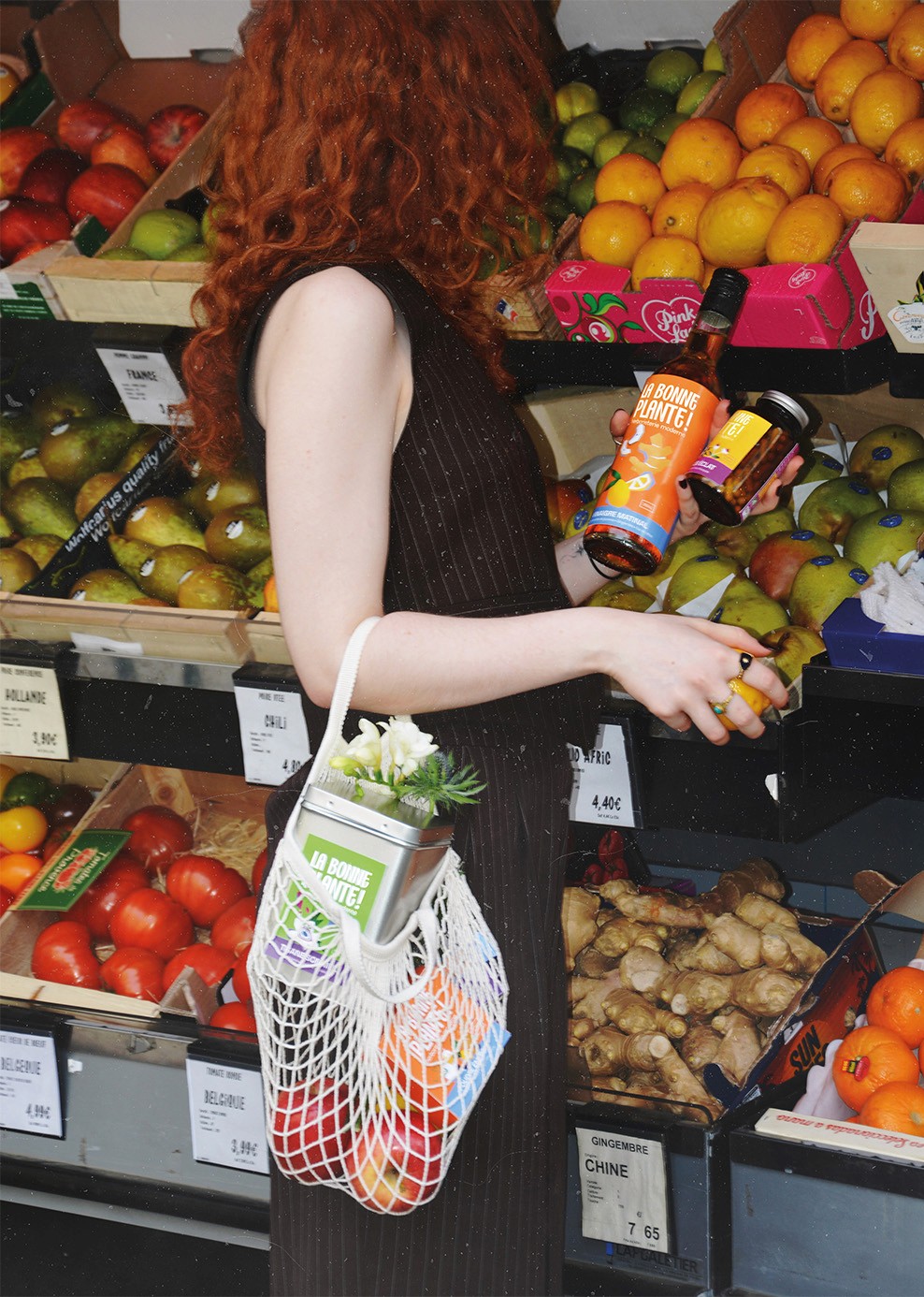
Meanwhile, social media takes a trend-driven lifestyle approach. It positions the products as attractive and desirable—a little everyday boost—while emphasizing their natural, high-quality sourced ingredients.